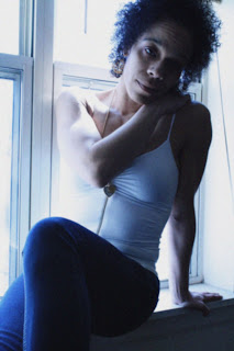
Tuesday, May 10, 2011

Color Edits-Selective Coloring


Technique: For both pictures the objective was to decide the areas in which we felt some coloring would not detract from the image, but enhance it. And for that reason, I chose to put the color change in the background, so that my main objects would pop out more. For the top picture the coloring is more suttle, so that it wouldn't completely take away from my picture and what I was trying to say. But the second image with the bleeding heart, the coloring was perfect. The fact that the color was a deep red only added to the picture. It definitely made the picture better in general.

Assessment:Overall, I think both pictures acae out well. I just think that I need to remember when adding the color to the pictures, I can't release the mouse because when the color overlaps it removes the previous color, deleting the color completely. But, overall, they both came out pretty well I think

Monday, May 9, 2011

Color Edits-Gradient Maps, Gradient Tool, Solarization


Solarization

Gradient Maps

Gradient Tool

Technique: For the solarization, the key is to make either a "U" shape, or a hill/mound shape, in the curves adjustments, depending on what you're looking for. The hill-shape creates a positive form, and the "U" makes a negative. So, you take the ends of the curves and bend them according to the shape you want to make. For the Gradient Maps, you go to the adjustments curves, click gradient maps and mess around with the coloring to find the one you like best. And for the gradient tool, you click the gradient tool. And there are many options, but for the assigment we were supposed to use the gradient tool to blend two pictures together. So in order to do that, you choose two pictures, drag the background of one picture to the other. Click the gradient tool, click on the layer mask for the gradient tool and choose one of the options on the top of how you want the gradient image to show, then click the image and it should blend the two pictures, according to the gradient blending shape you chose.

Assessment: Overall, I think the pictures came out very well. I think my favorite of the images would have to be the blending with the gradient tool. The images come out so much more differently than just using the regular blending tools.

Thursday, May 5, 2011

Color Edits-Mood

Technique: When I took the picture I decided to close the blinds in my brother's room because his blinds are red. And I figured the light would project a redish hue in the background to emit red color, to fit the monochromatic requirement. And when I edited it I used the vibrance and the hue/saturation to make the color pop more. And after, to make the red a little more red I used the selective color tool, to enhance the red to show the red off a little more.

Mood: I clearly chose red to show love, and I took a picture of myself, and my autistic brother. With our heads touched like this, it's his way of giving someone a kiss. He leans his head inward and waits for you to kiss his head, like a pet I guess you could say. But, overall the red was emphasized to show my feelings for him. He's someone I will forever appreciate, therefore I had to show the love I had for him.

Thursday, April 21, 2011

High Contrast, Vintage Coloring, and Pictoralism


Pictoralism:
-Technique: My mom offered to be my model for a few shots, and instead of portraying love, she portrayed the opposite, heart-broken. After that I messed with the camera angle, and the location of her body for a while, but then I realized that the windows in her room gave the most lighting, and that's when I told her to sit in the window sill because it would give a lot of back lighting, which would complement the picture a lot. Then for editing, first you need to make sure the picture is on safe filter mode. And after doing so, add a layer mask to protect the pixels in the image. After that, add noise in the filter mode, and then add some Gausian blur to make a fuzzy vignette around the entire image. After I went back through the steps and added some more noise to make the pixle-ish look pop more.

-Assessment: One thing I really wish I would have done, was to have been more brave with the noise, so the picture looked more like pictoralism. It wasn't the best edit I could have made with this particular concept.
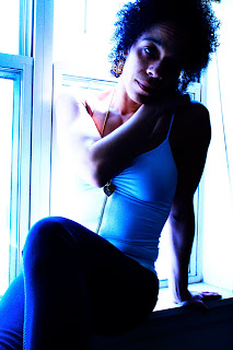


High Contrast:
-Technique: Editing pictures to give them high contrast is pretty simple actually. Just go to the curves tool in the adjustments bar, and make an "s" shape, but play with it a little more to make sure that the contrast really pops.

-Assessment: I don't really have any weaknessess I feal, for this picture, besides maybe adding a little more light to the picture in general before adding the high contrast.
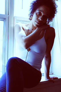

Vintage Color:
-Technique: Vintage coloring is also as simple as the high contrast. Go to the curves tool in the adjustments bar and click the scrool down bar to get the different color selections and mess with the colors. The red is supposed to be pulled down on the top, and above on the end, to make an "X" type mark. After that the blue and green should be bent to make the "S" shapes. In the end the colors all balance out, but you can continue to play with the colors to get the ending result you like most.

Assessement: I think this picture went very well, I don't have any weaknessess for this one either.

Monday, April 18, 2011

Text and Image


Technique: First, I tried using the pencil tool to create the heart shape, for the lyrics. But, that didn't work well in the end. So, after getting some help from my teacher, I discovered that you can take the elipses shape tool, and bend it to make different shapes, and eventually I was able to create a heart that was more well-rounded and shaped more like a heart. Afterwards I played with the the text tool, but I knew exactly which lyrics I wanted to use. I chose to use lyrics from the song 'Sigh No More' by Mumford&Sons, because it's my favorite song on their album, but also because the lyrics are very heartfelt and real. From there I chose different fonts and colors to really express the lyrics as best as possible. Although if I had more time, I would have probably found colors and fonts that were even better. Overall, I was happy with the way the picture turned out.


Assessment: Firstly, I should have retaken the image to reveal some more of the heart shape, so that it became more obvious that the picture was of a heart shaped box, instead of some random heart shape. Just overall the clarity of the image should have been better. Secondly, I wished that the heart shape, fit the image more than just looked like it was posted on the the image. Overall, in the end, I am pretty satisfied, I just know that it could have been better.

Tuesday, April 5, 2011

Sharpen Assignment

Technique: Well firstly, in the process of editing I lowered the vibrance in the picture, because it was just too bright, and it kept the sharpen from fully popping out of the picture. Afterwords, I sharpened the image, twice, using the High Pass, on the filter. And eventually the picture came out right. After that I played with the color and vibrance and got it to fit the sharpen so that it all came together and popped. Reflection: Overall, the picture and editing went well. I just have to remind myself next time, that when taking pictures inside, with fairly bright lighting, I should turn down the ISO so that the picture isn't overly bright so that it takes away from the subject, and the picture overall.

Thursday, March 17, 2011

Rhythm(Repitition) Assignment


Technique: Overall, the pictures were taken in a sequence, so that they would in the end come out to blend together well. The idea was to set the camera on a tripod and have the subject move continuously as opposed to moving the camera to fit the location of the subject. The point of that was to make it so that when the subject was put in the same shot repeatedly, the image overall would look like the person moved, not the background. The process into editing the pictures was to take one of the shots from a sequence and use it as a background. Then to use the selection tool, and grab the other subjects and drag them into the background. Afterward I edited some of the layers so that the lighting matched up with the location of the subject. Also, it became necessary to add some shadow below the subject in some of the locations, so that the overall image looked more realistic.
Reflection: Since this was my first time ever creating images like this, I did have a lot to improve on. Firstly, my selections could have been a bit cleaner, up close you can see the spots from the other images. Secondly, I felt like I could have done something more interesting with my shots. I feel like I say that every assignment, so maybe next time I need to actually take out the time to figure out what I really want to shoot, and make it happen. However, I can't say that my model wasn't great, because he was. It was because of his willigness to let loose during the shoot that made it easier to take the shots. Overall, I am pretty happy with the images. But I would have prefered a nicer background, and maybe had a few action shots instead of just repition all the way through.